As I prepared my presentation deck covering converting SCORM content to cmi5 for the fall xAPI Cohort Party, I reminisced about various parts of the CATAPULT project and the sometimes unexpected starts and stops we made while experimenting with creating the cmi5 course templates.
One of the important CATAPULT goals had little to do with testing LMS platforms or developed content. Instead, there was a specific outreach goal to design content examples that satisfied a series of goals to speed up adoption:
- Show as many best practices as reasonable.
- Include tricky elements to show how to avoid mistakes.
- Use well-known public/open source assets.
- Be accessible to a wide variety of content builders.
These goals clash at times and many of our sub-goals were compromises around this. This is the story of how we achieved those goals and some of the more interesting compromises.
In the Beginning…
When we release code into the wild, one of the things that commonly runs through the developer’s mind is “how are other developers going to perceive this?” Open source can be a beautiful model of cooperation and has done so much for the world. It’s built on the backs of significant amounts of labor from widespread audiences. With that level of scrutiny, however, comes a significant amount of opinion. You’ll definitely never satisfy everyone all of the time in software development. Instead, we picked a few highly represented audiences as our primary targets and set a goal for each:
- Instructional designers who only use authoring tools. We wanted the templates to be representative of both older-style and modern design practices and to capture a reasonable cross-section of visual interactions expected for a standard authoring tool.
- Instructional “developers” with a slightly technical (Javascript-capable) background. They are comfortable tracing through Javascript in a browser-based setting and can identify what actions trigger what behaviors and make small modifications to test out various behaviors.
- LMS developers. This audience would be highly technical and would be looking to verify their implementations against content examples to make sure that they’re hitting all the high points of a real implementation.
The astute reader will note that there’s an important gap in these choices: deeply technical instructional developers. Much of the existing materials, the new Best Practices Guide and the various artifacts of CATAPULT address some of the deeper considerations for this developer role, and this group is the most equipped to “read between the lines” for this particular task.
Planning the Content Pieces
Deciding how to break apart the course’s operational components turned out to be the most reorganized part of the entire project. Outside of the packaging/manifest pieces, a learning standards course can be roughly decomposed into the following visual and internal pieces:
- Raw textual content
- Media – audio, video, images, etc.
- Navigation – including bookmarking, menus, and flow elements
- Rendering engine – what makes the current state of the course visible and lays out the components
- Standards tracking – what communicates learner records with the LMS
Starting on the Front 9
We started near the SCORM golf courses end credits: a nested frame-based DOM structure. There were some obvious wins. This approach allowed for the content pages to be traditional HTML files that can be navigated through standard links, which is the simplest way for traditional design to be done. The navigation controls and overall behaviors, being in a single outer frame, would mean that no navigation of the parent window occurs, preventing any complicated state retention around potential reloads of the top-level element that the LMS launched (Best Practice #17 – “Persist AU Session State” ).
It also comes with some significant drawbacks. The most obvious one is … it’s 2021. For the vast majority of use cases, frames are an artifact of a bygone era. Frames generally work poorly on mobile devices and cause rendering artifacts. While it’s possible with iframes to address most of this, at best it represents a model that is archaic and at worst it would prevent us from our future efforts around more modern course design. This was a good warmup but was sliced rather quickly.
Plan B: Reworking the Plan
Next, we put all the markup directly in the renderable DOM between the <body> open and close tags. While extremely simple, it resulted in an immediate load at launch time of every asset in the package. Not a great instructional design approach, and it resulted in slow initialization times [1]. This was definitely a no-go.
Instead, we took a swipe at using a container HTML file and then retrieving HTML blocks from external files. While generally a good content design practice, the external files required a complicated loader and significantly muddied the Javascript waters related to managing the content player state.
A few iterations later, we found the best balance. We identified that the markup itself that represented the page contents could be measured in a few kilobytes and would not significantly affect the load time if it were stored in the main HTML document. Since we wanted to avoid rendering it until needed, we placed each of these blocks in their own <script id=”pageX” type=”text/template”> tags [2].
The Content Thickens
During this, we were also organizing the navigation and tracking components and designing the basic course flow. We tried constructing a set of top-level functions where the course flow and the tracking calls were all inline together. For the simplest case, this wasn’t too bad.
Then we tried to add on bookmarking. And a quiz.
Bookmarking itself, which isn’t a cmi5 feature and isn’t a client library default, meant bringing in a series of xAPI Activity State calls on both the saving and loading side, which muddied the course structure code a lot. Additionally, the quiz tracking added even more load as we added in several HTML input types and tried to map those to the various xAPI interaction types. Things were precarious, but there was hope.

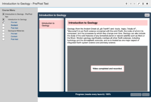
Screenshot of a course after the video has been played.
Until we added on a video player.
From the start, we always viewed video as a critical component of the entire template project. Video provides a mechanism for demonstrating a common task and an excellent way to show cmi5 working with another xAPI Profile (the xAPI Video Profile).
Adding a video to the DOM is easy. Adding all the things a video and a statement profile represents, significantly less so. Providing an event capturing engine for all the xAPI Video Profile requirements and the statement generation efforts attached made the entire JS player far too wide to follow reasonably.
With the cmi5 JS core library by this point separated out into its own file, the simplest additional separation was to do what authoring tools do: use a plugin-esque architecture for eLearning standard actions and let that manage all cmi5 core library communications. The course flow and setup became significantly less painful to read through and the necessary functions and signatures fell into place.
Rocking the Courses
After our short flirtation with the old-style golf frames, we jumped fully into a modern responsive layout reflecting the well-known style choices authoring tools take. However, much of the stakeholder content examples represented an older design style. We had independently already scratched out a standalone template that behaved roughly like these “framed” [3] courses, and we had a very strict goal in mind: all the content had to be exactly the same markup between both design types. This addresses all the major elements: content layout, viewport rendering, and tracking.
This went surprisingly smoothly. The biggest deviation was moving certain simple event handling and configurations out of the primary course Javascript and into the main initialization script. This boiled down to top-level navigation elements and window-based sizing controls, as those were the event behaviors that couldn’t be shared reasonably between design styles. CSS was also forked and kept each CSS design fully independent.
Making Decisions
Let’s get into the meat of the decision making process. What did we struggle with and/or what were things we felt strongly about, and where did we land on them?
Managing the raw cmi5 interactions in Javascript. This was difficult right off the bat. We wanted the courses to be extremely accessible to view and understand the operations, but we also wanted to use technologies that people building these packages would use. We experimented with different approaches to the raw cmi5 JS layer and eventually settled on using our own public @rusticisoftware/cmi5" target="_blank" rel="noopener">open source cmi5 JS client library. This will carry a significant burden of documentation separate from the course templates that is reusable in a fully independently manner and can move forward and improve as new cmi5 needs arise.
Not requiring a compile step. Modern JS projects almost always compile and minify their projects, for a number of reasons. They’re all completely good and valid reasons, and in any meaningful distributable course package, we would do the same. However, there are a few trends in the JS ecosystem that are common and it changes very significantly over time. Avoiding that means the packages themselves are immediately usable and inspectable in the same way that they’re stored in the source repository, hopefully minimizing the boundaries to understanding and getting going with the examples. It also means that there’s less risk that they will break due to JS ecosystem changes as they age.
Not using a framework. Speaking of changes in the JS ecosystem, these courses are POJ (Plain Ol’ Javascript) with no dependency on a modern UI framework beyond ES7. This choice was meant to minimize friction for non-developers. These various libraries have had cataclysmic changes over the years, and almost all can be said to have certain complicated patterns to learn to be effective with them. The example templates instead rely more heavily on the DOM and data- attributes plus traditional JS manipulators (document.getElement* and document.querySelector*). By minimizing outside code dependency, it is more likely that the packages will continue to perform the same in browsers year after year.
Keeping a reasonably low common denominator. As mentioned, the course examples do their best to be plain ES7. We tried to keep as wide a browser compatibility matrix as reasonable, occasionally at the expense of code readability.
Putting all the content as loadable templates. We spent significant time on this topic (and above), and the solution of script templates that works well was not immediately obvious.
Using query parameters in launchable AUs. While niche, a common SCORM player flaw was to ignore query parameters specified in the resource “href” attribute that represented the launchable asset. Ignoring these meant that the HTML document the SCORM package referred to would launch but not perform correctly as it was missing expected variables. We designed the packages to misbehave somewhat more visibly if their query parameters weren’t included when launched. We didn’t quite meet this goal as the visibility was not aggressive enough and still resulted in filed issues.
Going From Golf Balls to Geodes
The entire CATAPULT project was incredibly successful at hitting targets that covered all cmi5 ecosystem parts, and I like to think that the course templates give people easy to use assets. Even with this success, we learned or reinforced some of our own notions that we’ll carry with us on new projects.

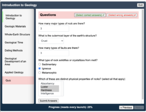
cmi5 course quiz with answer button and correct answers.
- When building instructive examples, don’t try to over-simplify.
- Not everything in the browser needs a modern framework or a build ecosystem (but almost all non-trivial things do).
- If you want something to fail, be intentional and extremely visible about it. Breaking behavior isn’t enough.
- Even when you’re not using builds, script as much of the package management process as you can.
- If you build it, they will come. And ask questions. And they’ll be happy that someone else did the heavy lifting.
- Next time, pick a course topic that has more explosions in it.
- Ask everyone! Special thanks to Ryan Donnelly, Joe Donnelly and Kyle Patmor for their significant additional insights around what our customers think about when they use sample content. The courses have certain features (like the button that answers all the questions at once) specifically due to them that I expect will be loved for years to come.
If we’re lucky, these courses will be useful instructive starters to introduce people into cmi5 for many years to come. And maybe one day we’ll run out of rock jokes for these geology courses, but so far they’re still coming in Fast & Furious.
Questions about the templates? We’re happy to help!
—-
[1] DOM ready event firing is complicated and fraught with browser-specific tedium. This description isn’t perfectly precise, but things were bad enough that the details didn’t move the needle enough to bother with the details.
[2] In a perfect world, we would still want to wait until media assets were appropriately fetched before exposing the page content to the user, but this small compromise provides a significant reduction in complexity reasonable for an example of this nature.
[3] They didn’t use frames, they displayed like a framed picture, content contained in colored/styled bordered boundaries. In hindsight, this was probably the worst name choice. Don’t let the engineers name things.


